Brand Identity
Private Chef Studio · Orange County, CA
Hospitality, plated.
Private Chef Studio · Orange County, CA
Hospitality, plated.
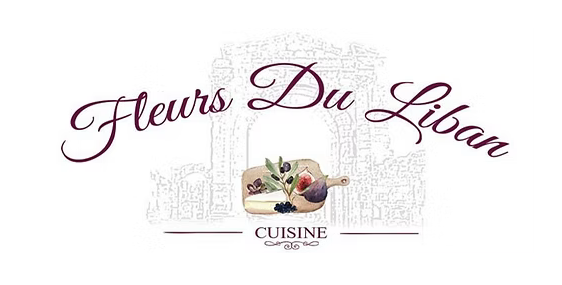 Before
After
Fleurs du Liban is a private-chef and catering studio bringing the warmth of the Lebanese table to homes and gatherings across Orange County, Los Angeles, and San Diego. The original identity carried the charm of a family kitchen, warm script, illustrated detail, and the handwritten character of a beloved neighborhood spot. As the studio has grown, it needed a brand to match: refined, elevated, and built to carry the cuisine's quality at every touchpoint. We rebuilt it from the ground up.
Every menu is composed with intention, never one-size-fits-all. Drawing from authentic Lebanese flavor, tailored to the style, the size, and the spirit of each occasion.
From an intimate four-top to a celebration of one hundred, each dish is prepared and plated with care, the presentation as considered as the cuisine itself.
From the first conversation to the final plate cleared, every detail is handled (quietly, professionally, and with ease) so the host can stay at the table.
Rooted in Lebanese tradition.
Elevated for today.
, The Studio Promise
An intentionally narrow palette. Burgundy carries the brand. Warm gold lights it. Cream holds the page.
A high-contrast serif carries the name and the headlines. A copperplate script handles short, warm gestures. A clean sans does the quiet, functional work.
The olive branch, the cedar, and the fig, drawn from the land, appear as structural motifs throughout the brand system, grounding the identity in Lebanese heritage without relying on cliché.
A website built to carry the brand. Clean, content-forward, and designed for the full hospitality experience, from first impression to reservation.
Brand Identity by Creativision
Fleurs du Liban had the cooking. It needed an identity that matched it. If your business has outgrown the brand it started with, that is the work we do.